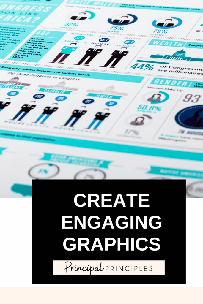

Create stunning graphics to make your reports, slide deck, social media, and your dashboards come alive with real-time data.
The process couldn’t be any easier either. Simply sign up for INFOGRAM and connect your data to begin building charts and graphs. For me, I connected our Google Spreadsheet to it, and my charts will automatically auto-populate with the data. As we update the Google Spreadsheet my charts will also update.
1. I started with Google Sheets which we update throughout the day.
2. Within a few minutes of creating my account in INFOGRAM I had my first chart created. You can brand all graphs, charts, and slide decks with your logo.
3. When the charts were complete, I added the infographic to our district’s website. You can simply do a link or embed the code. (NOTE: If you need the data to automatically update, this requires the paid version.)
Interactive charts and maps can add depth and intrigue to any article, presentation, or website.
Simply publish your project, copy the HTML code provided, and paste it into the text editor of your CMS or the space provided by the tool you’re using. Here is how I shared my interactive charts online.

I’m Stephanie, and I’m the face behind Principal Principles. I’m a former principal turned educational consultant, presenter, and edupreneur. I’m obsessed with giving school leaders the tools they need to lead a successful school.

Hello friend! Welcome to Principal Principles. I’m Stephanie, and I’m the face behind Principal Principles. I’m a former principal turned educational consultant, presenter, and edupreneur. I’m obsessed with giving school leaders the tools they need to lead a successful school.

Join over 63,000 leaders in our Facebook group! Principal Principles Leadership is a professional learning network for future and current school leaders. We share ideas and resources every day!
A description of what the benefit is of joining your list. Updates, sale notifications, resources?

