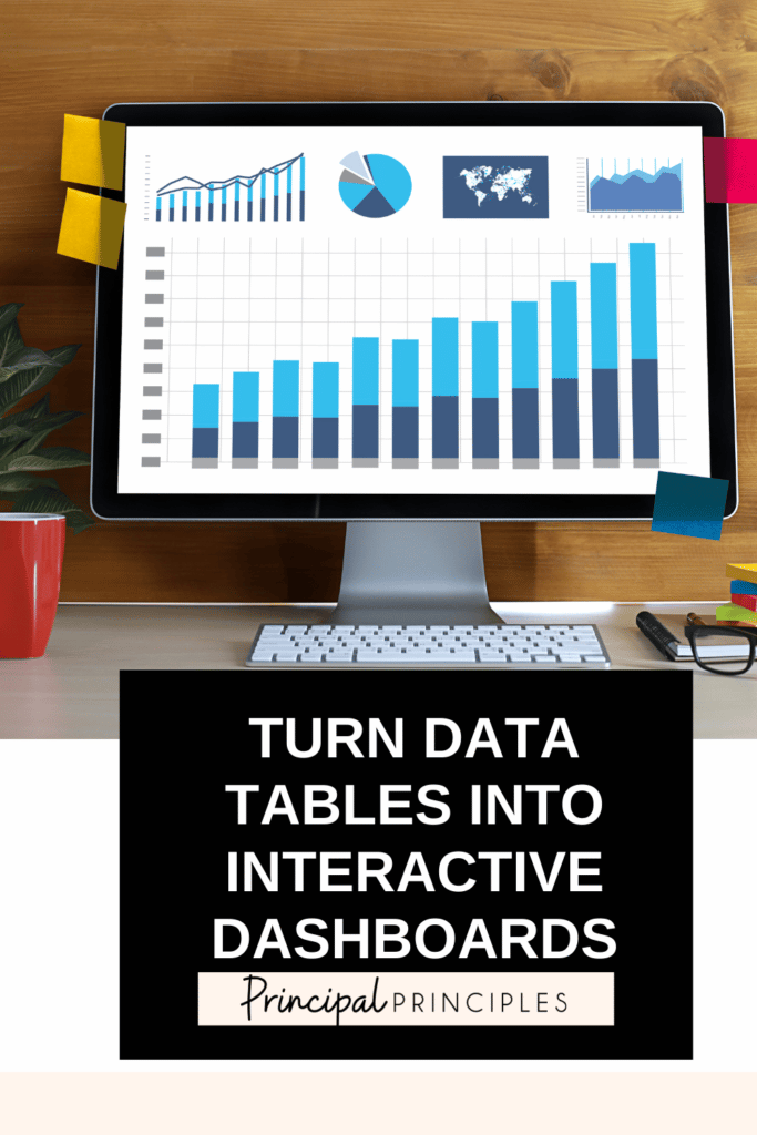

Visuals are important when you need a quick glance at the data. Your staff and community stay engaged longer when information is easily retained and accessible.
Let me share with you how I went from a plain chart to a dashboard that updates in real time!
It is easy to take a simple google spreadsheet and transform it into an interactive chart that updates in real time.
I am also thinking about the Schedule Email Delivery option for the future. For some projects, it would be great to see the data either at the beginning or end of each week to see how it changes.
I hope you have enjoyed this short tutorial.

I’m Stephanie, and I’m the face behind Principal Principles. I’m a former principal turned educational consultant, presenter, and edupreneur. I’m obsessed with giving school leaders the tools they need to lead a successful school.

Hello friend! Welcome to Principal Principles. I’m Stephanie, and I’m the face behind Principal Principles. I’m a former principal turned educational consultant, presenter, and edupreneur. I’m obsessed with giving school leaders the tools they need to lead a successful school.

Join over 63,000 leaders in our Facebook group! Principal Principles Leadership is a professional learning network for future and current school leaders. We share ideas and resources every day!
A description of what the benefit is of joining your list. Updates, sale notifications, resources?


4 Responses
This comment has been removed by the author.
Love love love this…I would love it more if you could do a quick video of how you got that information in data studio…I am playing with it, and got lost when I added the graph.
I would love a tutorial, too! This is great! I am a testing coordinator, and this is a great tool that I could use!
A video tutorial would be great!